Introducing, The Dreamers’ Bundle
Step into our East Fork headquarters, and you’ll find Field Notes journals scattered throughout the building—filled with design ideas, task lists, and manufacturing solutions. As a Chicago-based brand dedicated to U.S.-made paper manufacturing and the balance of form and function, Field Notes values fall in line with ours at East Fork, and a collaboration between our teams felt like a natural fit.
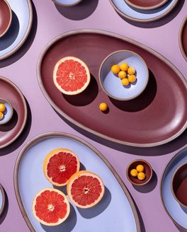
Each year, we develop our seasonal glazes around themes that challenge us to think beyond the kitchen and dining room. As the planning process began for our Fall/Winter collection, our team felt a pull towards dreaming beyond our current reality, entering into another world to create and imagine, and building a dreamscape in our minds and on our tables. It became clear that a dream journal (a new format for Field Notes!) would not only align with the season’s inspiration, but would also offer a new way to engage creativity.
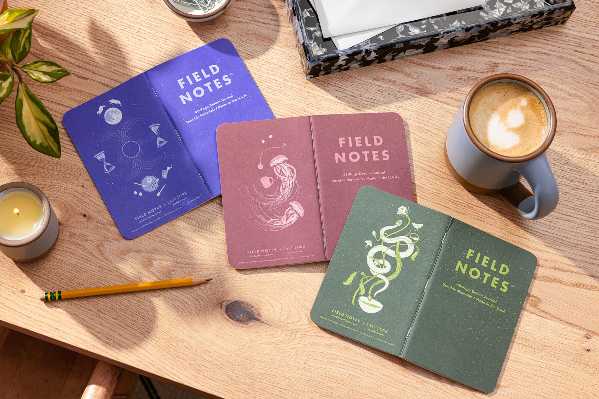
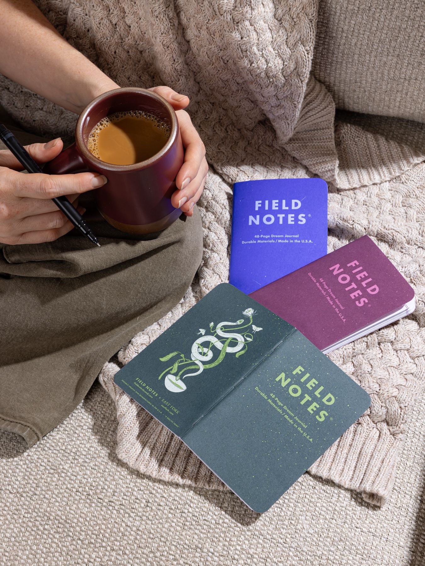
After months of collaboration between Field Notes’ Head Designer Bryan Bedell and East Fork’s Head of Design Nicole Lissenden, we landed on a 3-pack of dream journals with individual designs inspired by our three seasonal colors and universal symbolism of dreams. These journals are intended to capture last night’s dreams before they drift away, inspire you to put your hopes and aspirations down on paper, or simply help you build a daily journaling ritual.
We sat down with our Head of Design, Nicole Lissenden, to chat about the dream journals’ cover design process and the role dreams play in guiding both art and community.
Jasmin: Hi, Nicole! Can you walk us through the initial inspiration for the covers?
Nicole: We built all of our plans for imagery around our glaze colors. For the Fall/Winter collection we were playing around with the idea of dreams and dreamscapes, and escaping the moment by letting yourself drift. So, when we had the opportunity to collaborate with Field Notes, it just felt like a really cute way to tie-in the idea of dreams with our colors.
We wanted them to reflect night, sleep and common dream symbolism, so to start I made illustrations of snakes, teeth, clouds, moon phases, sheep jumping, and other little things that tied into those themes. That was the jumping off point. Then, we met with the Field Notes team a couple times and started making progress on the illustrations that helped me dial it in further and further.
The day the designs were due, Hurricane Helene hit. I had the designs ready to send, but obviously couldn’t send them. I was so excited about the project as a whole, but I felt like my execution didn’t quite hit the mark. They needed something that tied them together as a group but also they needed to feel distinct from one another.
So I was like, “Okay, I can't send them today because the power is out.. I can just work on them a little bit over the weekend.”
Jasmin: How did you approach incorporating our three seasonal glazes into the design?
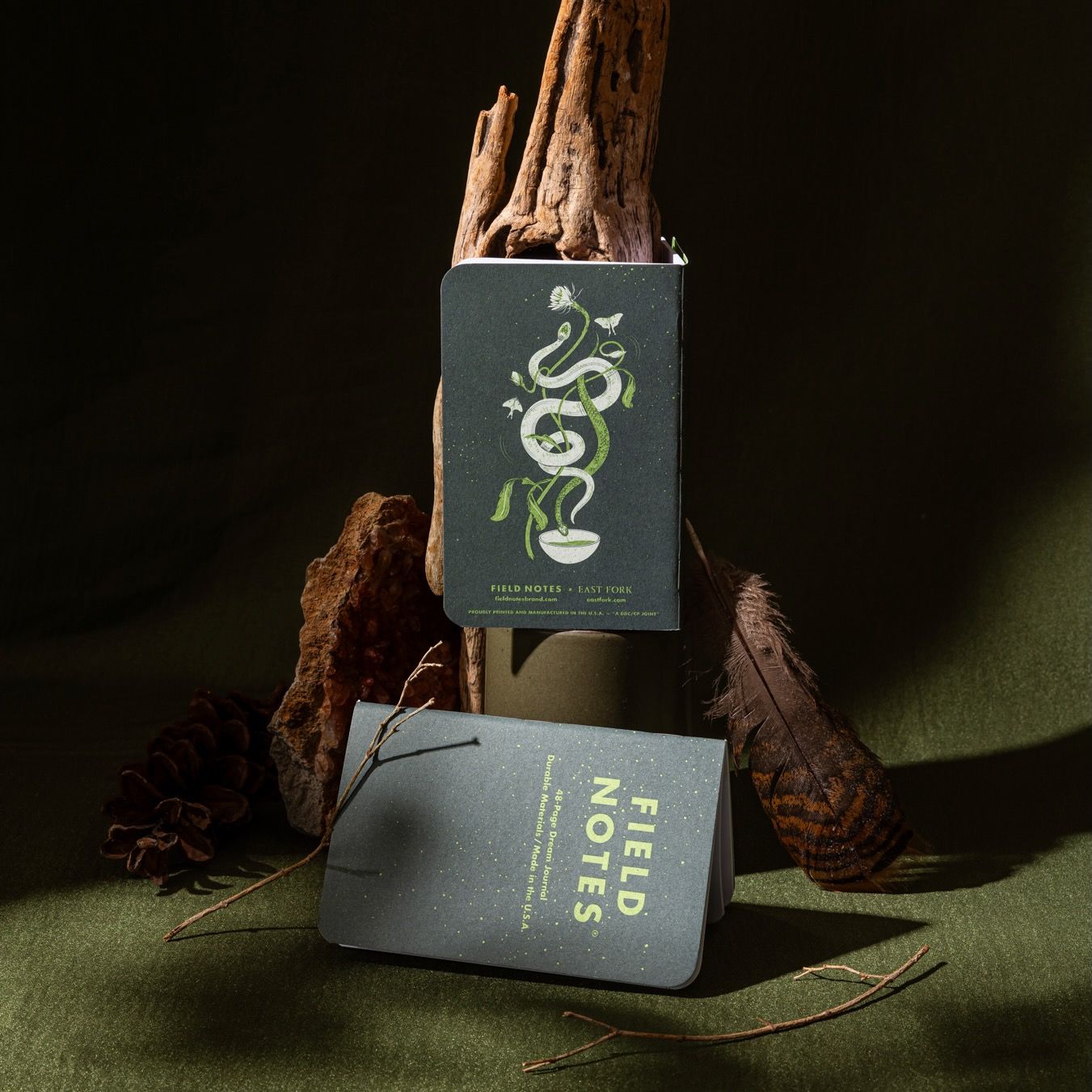
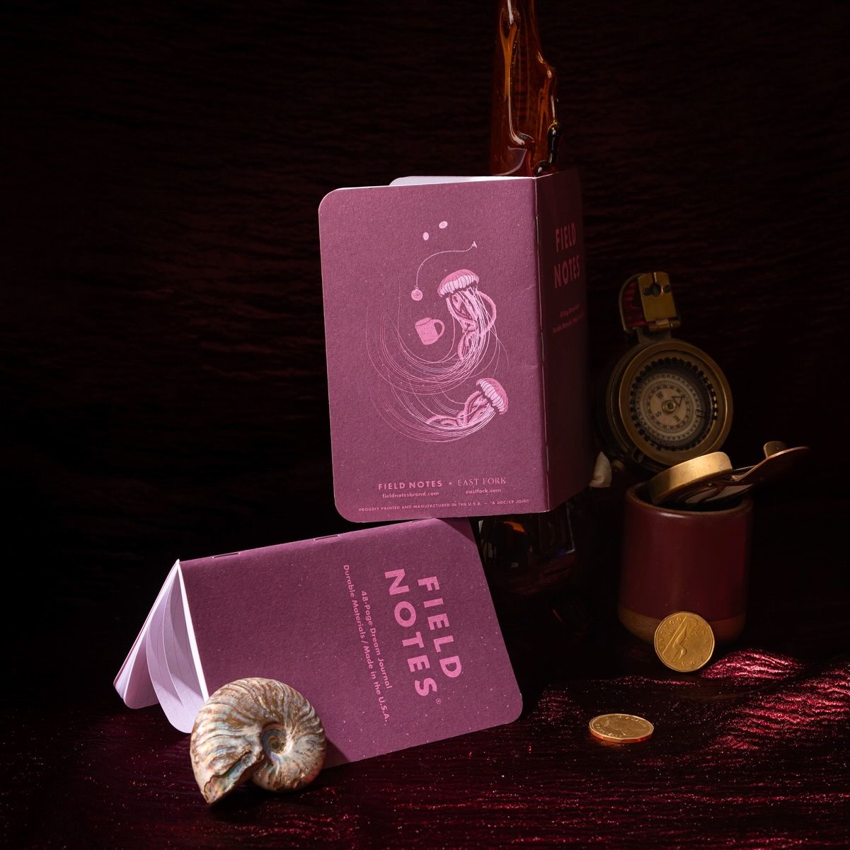
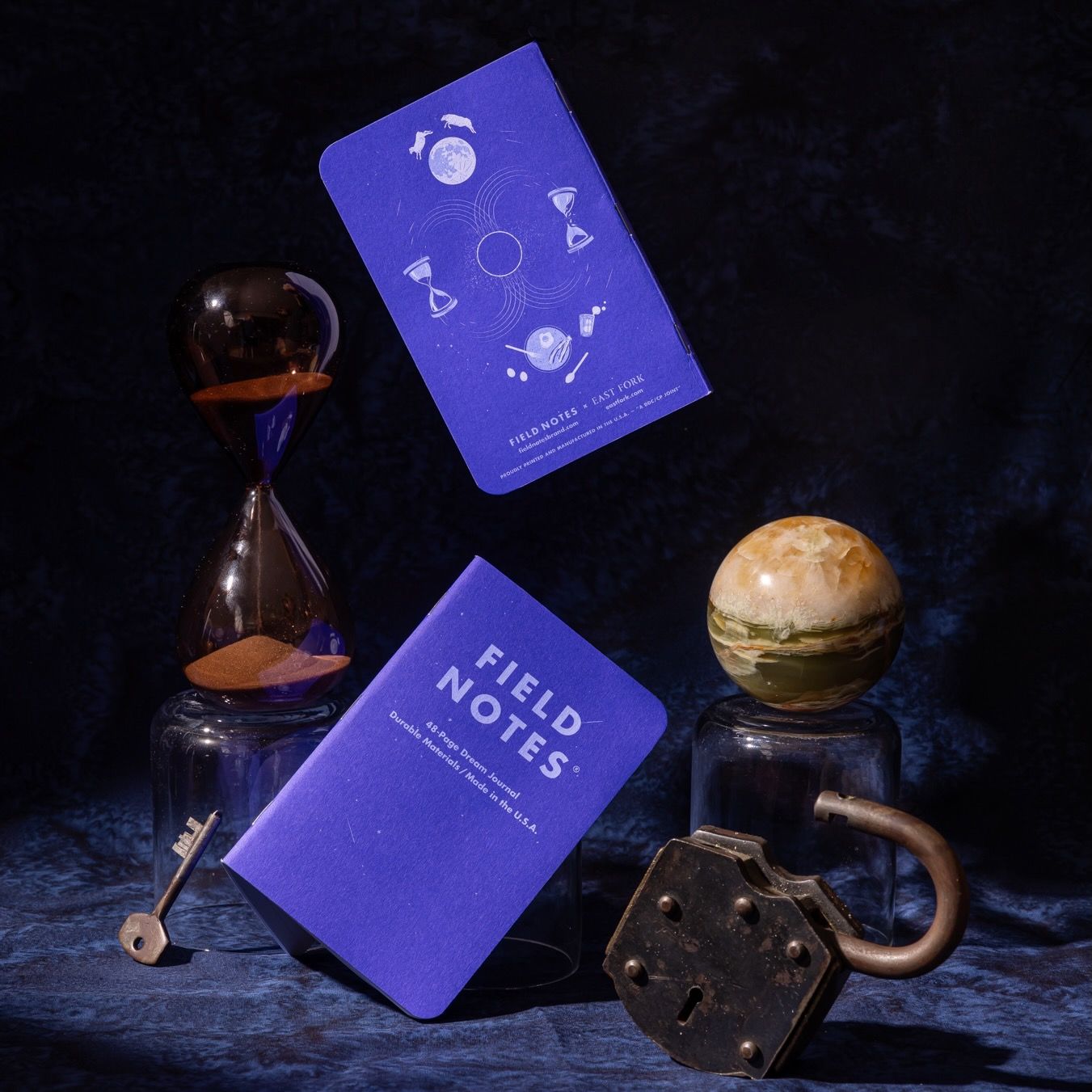
Nicole: Well, since my laptop was charged up I just kept working. It gave me something soothing to focus on at night after my kids were in bed. Something about being in that headspace and having that weird pocket of time allowed it to click into place: Wine Dark Sea could be an ocean dream, In the Pines would be a forest dream, and Big Sky would be a sky dream.
For In the Pines, the snakes serve as a visual anchor. I also liked the connection to night-blooming things and luna moths, too.
I’d designed a completely different cover for Wine Dark Sea before that weekend, but I landed on the jellyfish once I’d decided it would reflect an ocean dream. I usually rely pretty heavily on reference imagery when I’m drawing, but I didn’t have Google. So, it was kind of fun digging through my kids’ science books to find images.
The Big Sky cover felt more cosmic, so I rolled with the idea of an eclipse or a black hole in the center. And, I liked the broken hourglasses as reflecting the sands of time to play with the notion of time and space. There’s also cows jumping over the moon, too, and a table setting that’s nodding at the idea of being playful with your morning breakfast.
Lastly, each cover was designed with speckles as a way to mirror our pots.
Jasmin: Did the cover material affect any of your design choices?
Nicole: I worked with Bryan Bedell, Head Designer for Field Notes on the technical aspects of bringing these to life through print. All three notebook covers were being printed on one press sheet and we were limited to 6 colors, so Bryan suggested we print the dark and medium shades of each book, then use a tint of the medium color for the light color. He lent his expertise on paper and printing processes, and we landed on Eggshell Neenah Classic with solid spot color printing to maximize the amount of detail in print.
Jasmin: Do your dreams factor into your creative process?
Nicole: I feel most creative when I'm actively journaling. I've noticed that when I journal every day, I remember my dreams a lot more…I think that's good creative hygiene. I do notice that I feel most creative when I'm more connected to my dream life.
Jasmin: Would you share a dream you have for our region as we rebuild in the wake of Tropical Storm Helene’s destruction?
Nicole: I’ve lived in Asheville basically my whole life. I’m heartbroken over the devastation, loss of life, livelihoods, homes, and so much more. In the immediate aftermath, I didn’t hear many stories of people hoarding and turning on each other. I heard stories of spending time with neighbors, pooling resources, helping and accepting help. I saw it and lived it, like we all did.
I’ve felt the word community in my bones in a way I never really have before. My dream is that the community leads the way forward. That local officials collaborate with the community leaders who have always been on the ground, but really emerged out of the wreckage of this storm for everyone to see.
I dream that we support our artists and small businesses who make our culture and economy what it is. That we address our affordable housing crisis. Our hearts have been forever changed, and with that change needs to be a commitment to the people that were already struggling to live here.
Rebuilding will be such a big job, and we’ll all need to find our own ways to be a part of it. We’ve had the opportunity to break out of the silos that capitalism pushes us into, and we can really take care of each other.
My dream is that care is the cornerstone of our rebuilding.
